

Now Reading:

CASE STUDY 1 //
To Catch A Chef
Kosher catering, Caulfield South VIC — Full brand revival + Wix + Velo
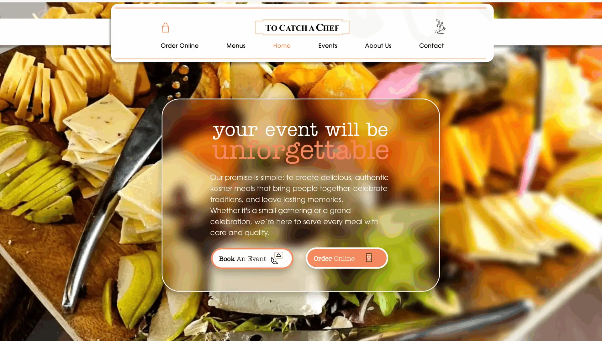
A fire destroyed the kitchen.
The rebrand brought them back stronger.
Scope: Brand identity, print, packaging, social, web — Platform: Wix + Velo — Industry: Hospitality — Location: Caulfield South, VIC
The Brief //
About a year before this project started, a fire swept through the kitchen of To Catch A Chef - a beloved Melbourne-based kosher catering business.
What could have marked an ending instead became the moment they decided to start fresh.As they prepared for their grand reopening, they came to me not just for a website, but to reimagine the entire brand.
The brief was to build on what people already loved - the warmth, the community, the food - while giving the visual identity a new chapter that matched who they were becoming.
The Problem //
A rebrand after a crisis is a different brief to a rebrand from boredom.
There's something at stake. The community knew To Catch A Chef.
The running chef logo was iconic - recognised by the people who'd been ordering for years, the families who'd trusted them with their simchas and corporate events.
Throwing it out would have been wrong.But doing nothing and just rebuilding the same thing would have missed the moment entirely.
The challenge was to honour the identity - keep what made it theirs - while modernising the visual language in a way that felt like a genuine fresh start, not a patch-up.
And then to carry that new identity across every touchpoint: print, packaging, digital, social, and a website that could open the doors again properly.
The Solution //
We kept the iconic running chef logo.
It had too much history and too much community recognition to lose.
But we gave it new purpose, refining it, recontextualising it, and weaving it through a complete visual system built for where the business was heading.
The full deliverable spanned the whole brand ecosystem:
Brand identity, the visual language was modernised while preserving what made it recognisable.
Colour, type, and the way the logo lived in different contexts were all defined and documented.
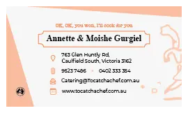
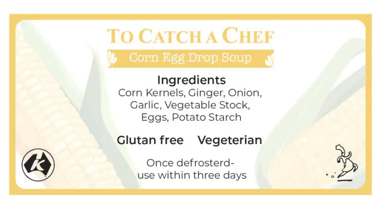
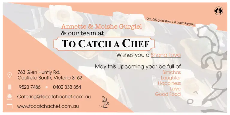
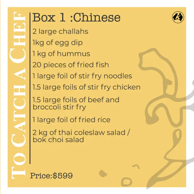
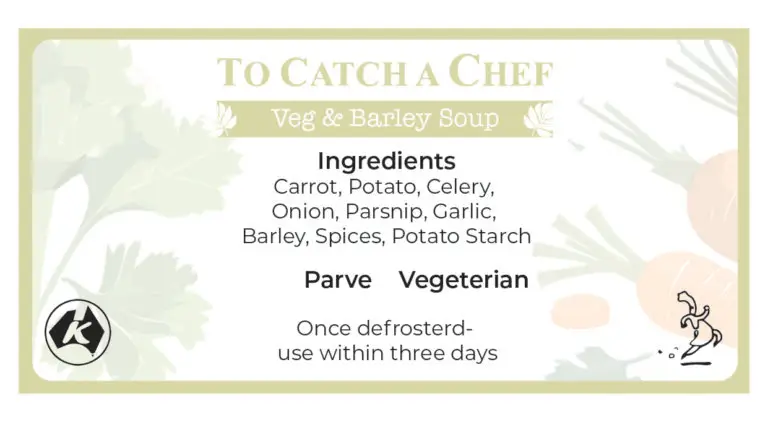
Print and packaging, product labels, packaging design, custom event invitations.
Every physical touchpoint carries the new identity.
Social media campaigns, a full marketing suite: templates, campaign assets, and a consistent visual voice across channels that matched the energy of the reopening.
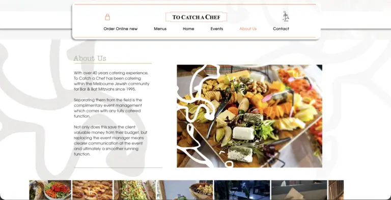
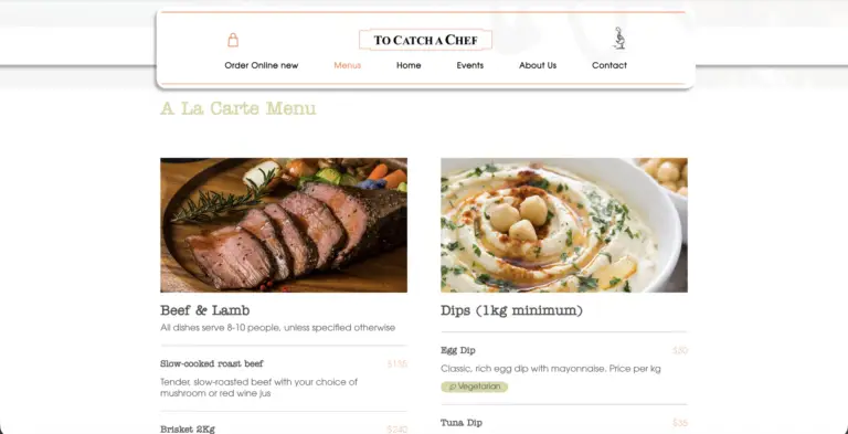
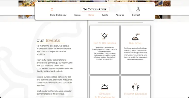
The website, built on Wix, the platform the chef already knew and was comfortable managing.
Rather than adding a migration to an already demanding reopening period, the decision was to make Wix do more. which is where Velo came in.
Velo is Wix's JavaScript development framework, letting you write real code on top of the platform to build behaviour the standard editor can't produce. The online store was built through Wix Stores with a custom catalogue structure: menu categories mapped to dietary requirements, clear item naming, and a checkout flow with as little friction as possible between "I want this" and "it's ordered."


The Result //
Identity, print, packaging, social, and web — one cohesive project
Running chef logo preserved and evolved, not replaced
Online ordering active from reopening day
This was more than a design job.
It was a story of revival, a business that faced a genuine crisis and came back with more clarity and presence than before. Seeing the brand evolve while honouring its roots is one of the most rewarding kinds of work there is.
Contact //
Ready to build something that actually fits?
No cookie-cutters. No templates. Just your problem, solved properly.